 I've spent part of today teaching myself how to plot data in R, mainly using the maps package. I found a number of ways of doing it, but this from Dana-Farber Cancer Institute was the best guide that I came across to get started (you can see I kept their color scheme). I still have tons to learn about this at the basic level, including getting the aesthetics right. Some of you are probably literally pros at this and may chuckle at my adorable mapping attempts, but hey: I'm new to this.
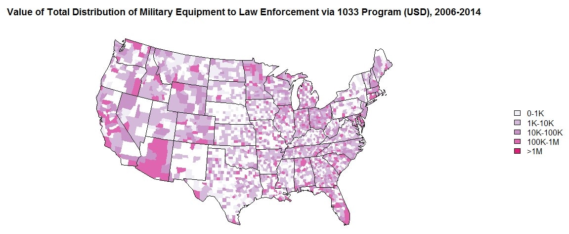
About the data here... This is part of a project I've been working on for some time that is getting closer to done and that I presented at MPSA this year (I suspect one or two of you may have been at that panel). I've been working quite a bit on the distribution of military equipment to state and county law enforcement agencies, specifically through the 1033 Program. In the aftermath of the shooting of Michael Brown in Ferguson, MO in 2014, the New York Times obtained the Defense Logistics Agency's list of equipment transferred under the 1033 Program. The problem with most of the plots based on that data is that it does not account for the fact that most of the equipment in that dataset isn't military equipment or it's a very specific subset of military equipment. The full data contains lots of desks, computers, exercise equipment, what have you in the way of non-military equipment, and other types of military equipment beyond what the NYT offers on the map in the link. I've gone through and coded every line (over 200,000 of them) of that data as military or not-military equipment. For the former, I've categorized further to test a number of hypotheses about why agencies ask for certain types and what are the outcomes of that on crime. The plot above simply sums the value of military equipment transferred during the time period the dataset covers, by county. Anyway, I'm hoping to wrap up the model specifications and estimations, address some feedback, and get it off to a journal soon. This was fun and I'm going to overlay some other stuff onto it, so hopefully it will be useful as well. Back to reading up on dynamic causal models of panel data.
0 Comments
Leave a Reply. |
AboutHave you ever wanted to follow my research in (not-quite) real time? You've come to the right place. Archives
June 2018
Categories |
 RSS Feed